
Performance
The chart below shows the daily closing prices for the S&P 500 since I started sending out email alerts of the market turning points. The line is BLUE those days that the model indicates that we are in an UPTREND and RED those days that it indicates that we are in a DOWNTREND.
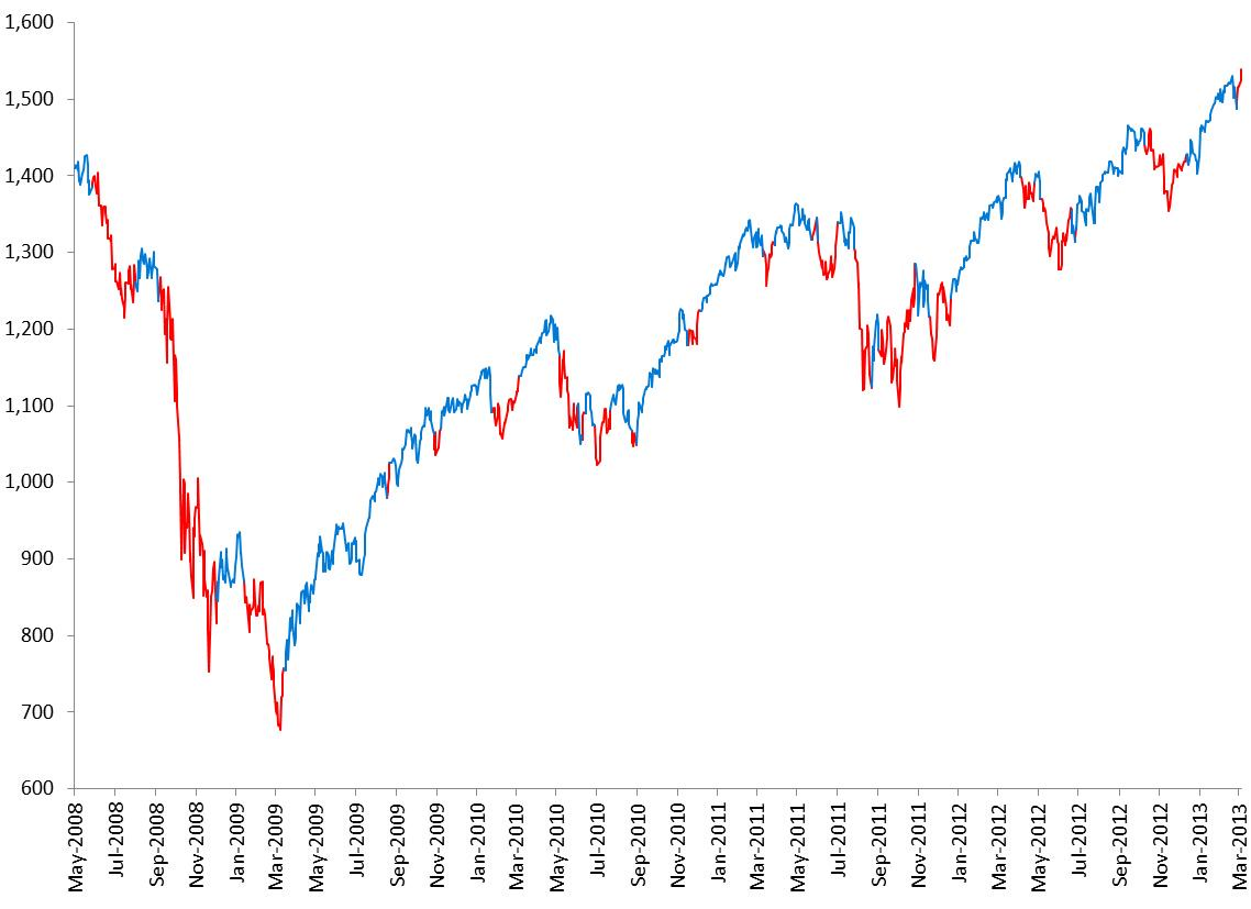
Click graph for larger image.
Dates when turning points in the model have been generated (updates are usually published on my blog the following trading day):
- March 5, 2013 – Uptrend
- The model has been in downtrend since April 17, 2013
- March 5, 2013 – Uptrend
- February 26, 2013 – Downtrend
- December 11, 2012 – Uptrend
- October 10, 2012 – Downtrend
- June 29, 2012 – Uptrend
- June 25, 2012 – Downtrend
- June 20, 2012 – Uptrend
- May 4, 2012 – Downtrend
- April 25, 2012 – Uptrend
- April 4, 2012 – Downtrend
- December 20, 2011 – Uptrend
- November 17, 2011 – Downtrend
- October 27, 2011 – Uptrend
- September 2, 2011 – Downtrend
- August 23, 2011 – Uptrend
- July 27, 2011 – Downtrend
- July 1, 2011 – Uptrend
- June 1, 2011 – Downtrend
- May 31, 2011 – Uptrend
- May 23, 2011 – Downtrend
- March 29, 2011 – Uptrend
- March 10, 2011 – Downtrend
- December 6, 2010 – Uptrend
- November 16, 2010 – Downtrend
- September 1, 2010 – Uptrend
- August 24, 2010 – Downtrend
- July 23, 2010 – Uptrend
- June 29, 2010 – Downtrend
- June 15, 2010 – Uptrend
- June 8, 2010 – Downtrend
- June 2, 2010 – Uptrend
- May 4, 2010 – Downtrend
- April 23, 2010 – Uptrend
- January 22, 2010 – Downtrend
- November 6, 2009 – Uptrend
- October 27, 2009 – Downtrend
- August 21, 2009 – Uptrend
- August 17, 2009 – Downtrend
- March 13, 2009 – Uptrend
- January 13, 2009 – Downtrend
- December 2, 2008 – Uptrend
- September 4, 2008 – Downtrend
- August 1, 2008 – Uptrend
- May 27, 2008 – Downtrend